What Makes a Good Website For Your Business?

TL;DR Summary
A Good Website
- A good website is a business tool, not a portfolio of your work
- Most websites that underperform have the same core problems: unclear purpose, no obvious next step, and no way to stay connected with visitors
- Looking good and functioning well (such as being mobile friendly) are two different things
- A website that isn’t actively updated, optimized for search engine optimization, or connected to your offers is a missed opportunity
- Fresh, relevant content is what gives people a reason to return
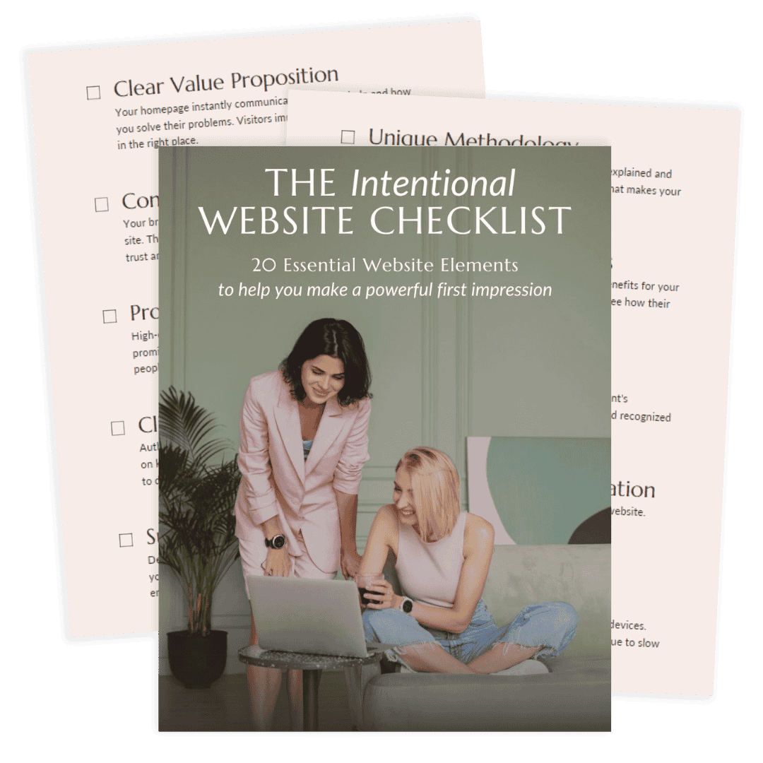
- The Intentional Website Checklist is a free 20-point way to audit what your site is actually doing
This post may contain affiliate links, which means I may receive a commission, at no extra cost to you, if you make a purchase through a link. Please see my full affiliate disclosure for further information.
A Good Website Does a Job
There’s a version of a good website that most people picture: clean web design, professional photos, clear branding. And those things matter. But they’re not what makes a website good.
What makes a website good is whether it aligns with user intent and works for your business. That means something specific:
- Does it tell a first-time visitor clearly who you help and what you do?
- Does it give them a reason to take the next step?
- Does it make it easy to actually do business with you?
A website that checks all three of those boxes is a good website, even if the design is simple. A website that misses them is not doing its job, no matter how much visual appeal it has.
I think about this a lot in the context of service businesses, where the website is often the first serious impression your target audience gets. They’re not just evaluating your design. They’re deciding whether to trust you with something that matters to them. A good website earns that trust and then gives them somewhere to go with it.
“I truly cannot say enough positive things about my experience with Liz! She was extremely professional, listened to my vision, was just as focused as I was on getting things “right”, and perhaps the best part- incredibly efficient! Turnaround time can be so slow for folks in the online business space, but Liz is truly exceptional at her craft.
I consider myself a pretty picky person, and Liz was understanding and detail-oriented so that we got it just right. I truly believe I will have more sales because of the page she created for me. The ROI is definitely there on the investment. If you’re thinking about booking her- DO IT!”
What a Good Website Actually Has
When I evaluate a website, I’m looking at a handful of things that consistently separate sites that generate leads from sites that just exist online.
A clear, specific purpose
The most common problem I see isn’t bad design. It’s a website with no clear primary goal. Every page is trying to do too many things at once, so the visitor doesn’t know what to focus on and leaves.
A good website knows what it’s there to do. Book calls. Build an email list. Sell a service. It guides the user journey toward one primary action that everything else supports.
Copy that speaks to the visitor, not about the business
Most website copy is written from the inside out: here’s who we are, here’s what we do, here’s our story. A good website flips that. It starts with the visitor’s situation, names their problem, and then explains how this business helps them solve it.
This is the hardest part of building a good website, and it’s also the most impactful. Good copy doesn’t require fancy writing. It requires clarity about who you’re talking to and what they need to hear.
If copywriting is an area where you want support, Danbee Shin’s Easy Guide to Website Copywriting is a resource I genuinely recommend for service providers who want to write their own copy well.

A visible, specific call to action
Every page of a good website should answer one question for the visitor: what do I do next? Not five options. One clear call to action that’s easy to find and easy to take.
If your homepage has a call-to-action, but it’s at the bottom after three scrolls, it’s not really functioning as a call to action. If your services page ends without telling someone how to hire you, you’re leaving conversion rates on the table.
Something that builds trust before the ask
A visitor who doesn’t know you yet needs a reason to believe you can help them before they’re willing to take action. Testimonials, a short and specific about section, and examples of your work all contribute to this. The placement matters as much as the content: trust signals belong near the decision point, not only at the bottom of the page.
The infrastructure to actually do business
This one sounds obvious, but it’s more common than you’d think. A website can look professional and still be missing the functional pieces that let business happen: a working contact form, contact information, a booking system, a payment method, a working link to what you’re selling.
I worked with a client who had an established, active website. She had years of blog posts and articles, a shop section, membership links. From the outside it looked like a functioning online business. But the membership links were broken. The shopping cart had products that were never set up. There was no way for anyone to actually pay her through the site.
The site was functioning as a content archive, not a business tool. We removed the distractions, fixed the broken infrastructure, set up a booking calendar for her services, cleaned up the website navigation, and cleaned up the navigation. The site didn’t need a redesign. It needed to work.
What Your Website Needs Right Now
The Portfolio Trap (and How to Spot It)
One of the most common patterns I see with established business owners is what I’d call the portfolio trap. The website exists to show what they’ve done, share their thinking, and demonstrate their expertise. And it does that well. But it doesn’t move anyone toward working with them.
It’s a content showcase, not a business tool.
This isn’t a design problem. You can have a beautiful, thoughtfully branded portfolio site with high-quality images that doesn’t generate a single inquiry. The issue is structural: the page layout is set up to impress rather than to guide.
A few signs your website might have drifted into portfolio territory:
- Visitors can read a lot about you but there’s no clear path to working with you
- Your most recent content is prominent but your services are buried
- There’s no email opt-in, no way to stay connected with people who aren’t ready to hire you yet
- You have a contact page but nothing that makes someone feel confident enough to use it
- The site reflects who you were two years ago more than who you are now
The fix is usually not a full redesign. It’s a strategic look at what the site is set up to do, and what small structural changes would make it function as a business tool instead.
A Good Website Evolves With Your Business
One thing that separates a genuinely good website from one that used to be good is whether it keeps up with the business it represents.
Businesses change. Services get refined. New offers launch. Positioning sharpens. The audience evolves. A website that was accurate and effective two years ago can quietly become a liability if it’s never updated to reflect where the business actually is now.
This is especially true for the pages that matter most: your homepage, your services page, and your about page. These are the pages visitors use to decide whether to trust you and take action. If they’re describing an older version of your business, they’re working against you even when everything else is right.
Fresh, quality content improves visibility in search engines and gives people a reason to return. A site that only ever shows the same static pages has no pull for someone who visited six months ago but wasn’t ready to hire you yet. A site with new blog posts, updated resources, or refined service descriptions gives that person something new to engage with when they come back.
A good website isn’t finished when it launches. It’s something that needs periodic attention to stay aligned with a growing business and its various channels, such as social media. The good news is that this kind of maintenance doesn’t have to mean a full overhaul every few years. Small, consistent updates to the right pages, including site speed and loading times, tend to do far more than sporadic large-scale redesigns.
Frequently Asked Questions
What makes a good website for a service business?
A good service business website does three things well: it makes immediately clear who you help and what you do, it guides visitors toward one specific next step, and it provides enough trust-building context including website security that someone feels confident taking that step. Beyond the basics, it needs to actually function as a business tool, meaning visitors can contact you, book with you, or join your email list without friction. A beautiful site that doesn’t do those things isn’t a good website for a business; it’s a good-looking portfolio.
What is the most important page on a business website?
Your homepage. It’s where most visitors start, and it sets the tone for everything else. A strong homepage tells a visitor within the first few seconds whether they’re in the right place, what you help them do, and what to do next. If the homepage doesn’t do those things, the quality of every other page on the site matters less.
How often should a business website be updated?
At minimum, review your homepage, services page, and about page every six months to make sure they still accurately reflect your business. Beyond that, adding fresh quality content regularly through blog posts or updated resources gives visitors a reason to return and gives search engines more to index, such as structured data and meta tags. This improves visibility in search results while maintaining technical SEO. The websites that perform best over time aren’t the ones that were built well once; they’re the ones that are maintained consistently.
What makes a website look professional?
Professional-looking websites share a few consistent qualities: visual coherence (fonts, colors, and imagery that feel intentional and consistent), clean layout with enough white space for content to breathe, responsive design, and fast load times. Good web design also incorporates accessibility. But professional appearance and professional function are different things. A site can look polished and still not earn trust or generate leads if the copy is vague, the navigation is confusing, or there’s no clear call to action.
How do I know if my website is actually working?
Ask whether visitors are taking the actions your business needs. Are people filling out your contact form, booking calls, joining your email list, or purchasing? If you have analytics set up, look at bounce rates on key pages and whether visitors are clicking your primary call to action. Also evaluate your website navigation. If you don’t have a clear picture of what’s happening on your site, a Website Wellness Review is a practical way to get one. It evaluates your site from both a designer’s perspective and a first-time visitor’s perspective, and gives you a prioritized list of what to address.
Not Sure What Your Website Is Actually Doing?
The question of what makes a good website has a simple answer in theory. In practice, it’s worth getting a clear, honest look at your specific site to understand where it’s working and where it isn’t.
A Website Wellness Review gives you exactly that. I evaluate your site from two angles: as an experienced web designer and as a first-time visitor focused on user experience. You receive a PDF report and a prioritized action plan after our live call so you know precisely what to focus on, without guessing and without committing to a full redesign before you know what actually needs to change.