Parry Medical Writing
A decade-overdue website refresh for a board-certified veterinarian and medical writer—done in a single day.
Project Overview
Dr. Nicola Parry is a board-certified veterinarian, pathologist, and BELS-certified medical writer based in the Boston region. Her business, Parry Medical Writing, serves two distinct audiences: pharmaceutical and biomedical clients who need expert medical writing and editing services, and aspiring medical writers looking to break into the field through her coaching program.
Nicola was on my email list when I launched the Website Rejuvenation Day as a beta offer in January 2025. She booked it. And she became my very first Website Rejuvenation Day client.
Her site hadn’t been touched in over a decade. The design was showing its age, but more importantly, it no longer matched the level of expertise she brought to her work. The root URL redirected visitors away to a separate about page, the color palette was stark black and white with gold buttons, and the navigation didn’t reflect the two very different client groups she now served.
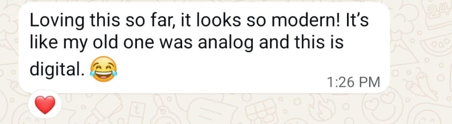
In a single day, we rebuilt the site’s structure, refreshed the visual design, set up her services navigation, added a booking calendar, installed legal pages, and connected her professional social profiles including her ORCID iD. Nicola described the result as going from analog to digital.
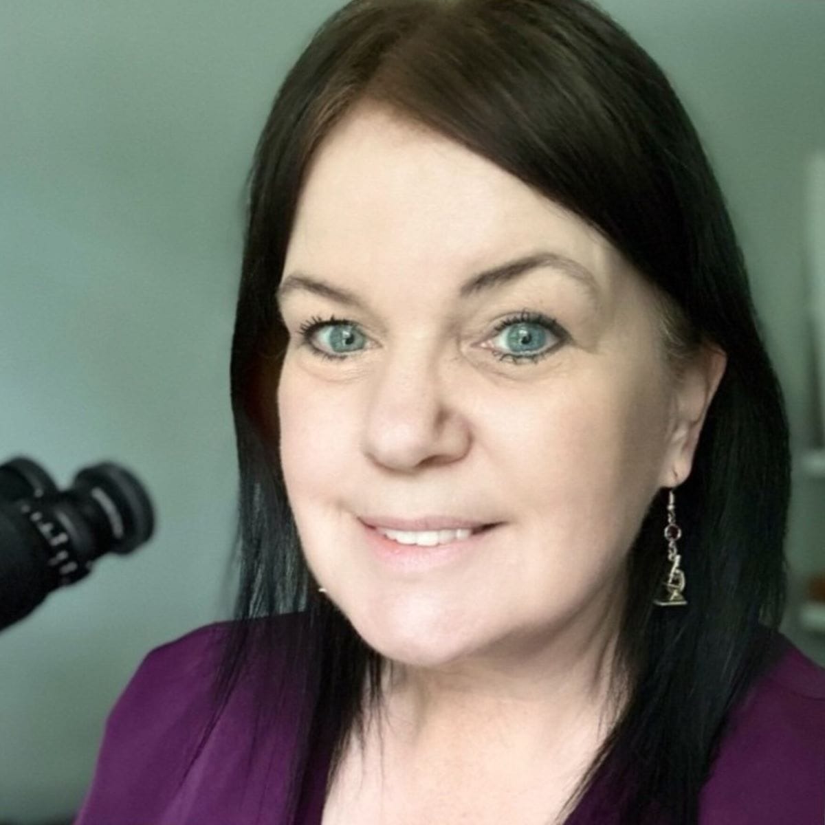
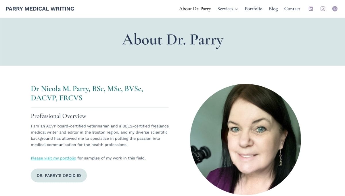
About Nicola
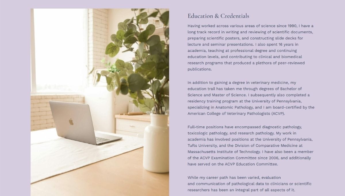
Dr. Nicola M. Parry, BSc, MSc, BVSc, DACVP, FRCVS, is an ACVP board-certified veterinarian and BELS-certified freelance medical writer and editor based in the Boston area. Her career spans diagnostic pathology, toxicologic pathology, academic research, and teaching at the University of Pennsylvania, Tufts University, and MIT. She has served on the ACVP Examination Committee since 2006 and holds multiple advanced degrees alongside board certification in Anatomic Pathology.
Through Parry Medical Writing, she offers medical writing and editing services to clients in the health professions, as well as coaching for veterinarians and scientists looking to break into the medical writing field.
Project Highlights


The Before
Nicola’s site had been running on the same design since she first launched it, and the navigation didn’t reflect the fact that she was now serving two very different client groups.
Visually, the site was built on a default WordPress theme with a black-and-white color scheme and gold buttons. It was functional, but it looked like it was built in a different era, because it was. The credentials and expertise on the page were impressive. The site itself didn’t match them.
She’d had the moment most clients have when they hand over their URL:
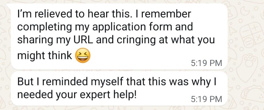
That’s the thing about a site that hasn’t been updated in a decade. It’s not that it’s broken. It’s that it quietly undersells you, day after day, to every person who visits.
What We Did
New Site Structure
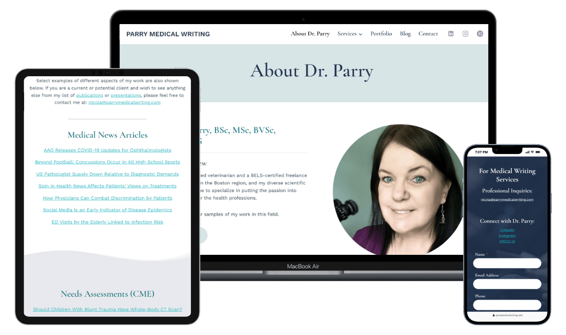
The first thing we addressed was the redirect that sent visitors away from the root URL to a separate about page. We fixed that so the site loads cleanly at parrymedicalwriting.com, with the About Dr. Parry content living right where visitors land. Small thing. Big difference in how a site feels to use.
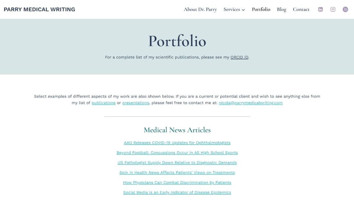
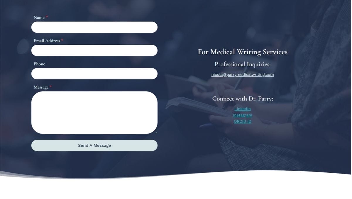
We also restructured the navigation to reflect Nicola’s two client groups: those looking for medical writing and editing services, and those looking for coaching to break into the field. The Services menu became a dropdown with two dedicated pages underneath it. We added a Contact page and connected her Portfolio, Blog, and legal pages in the footer, giving the site a complete, professional structure for the first time.
Visual Design Refresh
We moved away from the stark black-and-white palette to something that felt more aligned with Nicola’s expertise and her audience: a combination of navy, teal, lavender, and soft sage, brought to life with the free Kadence theme. The wavy section dividers gave the site movement and warmth without feeling fussy.
For typography, we paired Work Sans (a clean, modern sans-serif) with Cormorant Garamond (an elegant serif with a scholarly feel). For a medical writer with a long list of academic credentials, that pairing does a lot of quiet work.
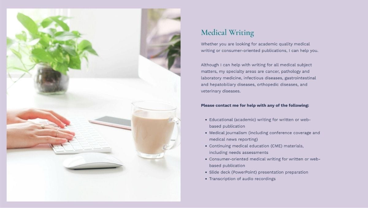
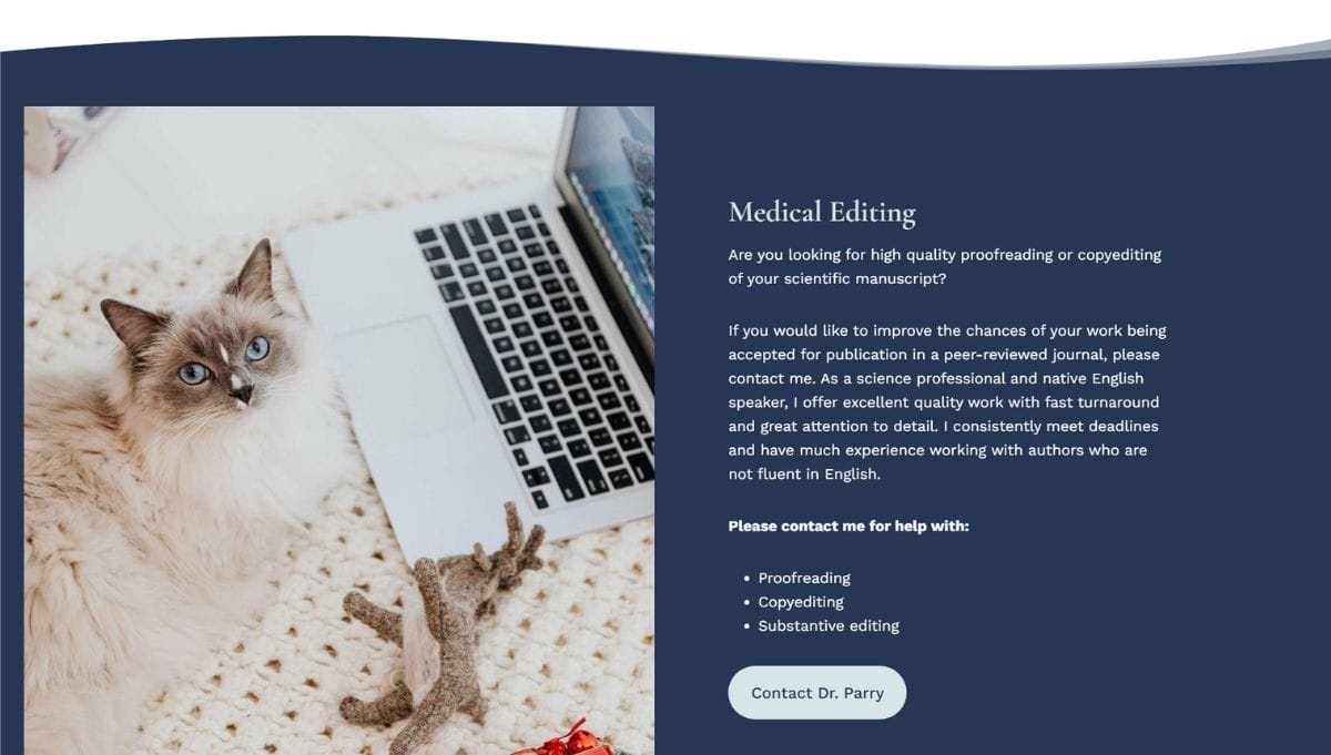
Services Pages
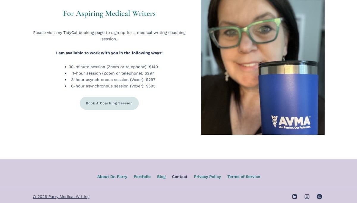
We built out two full services pages, one for Medical Writing Services and one for Coaching for Aspiring Medical Writers, each speaking directly to a different audience. Having these as separate pages under a Services dropdown made the site’s structure immediately clearer to anyone landing on it.
Booking Calendar
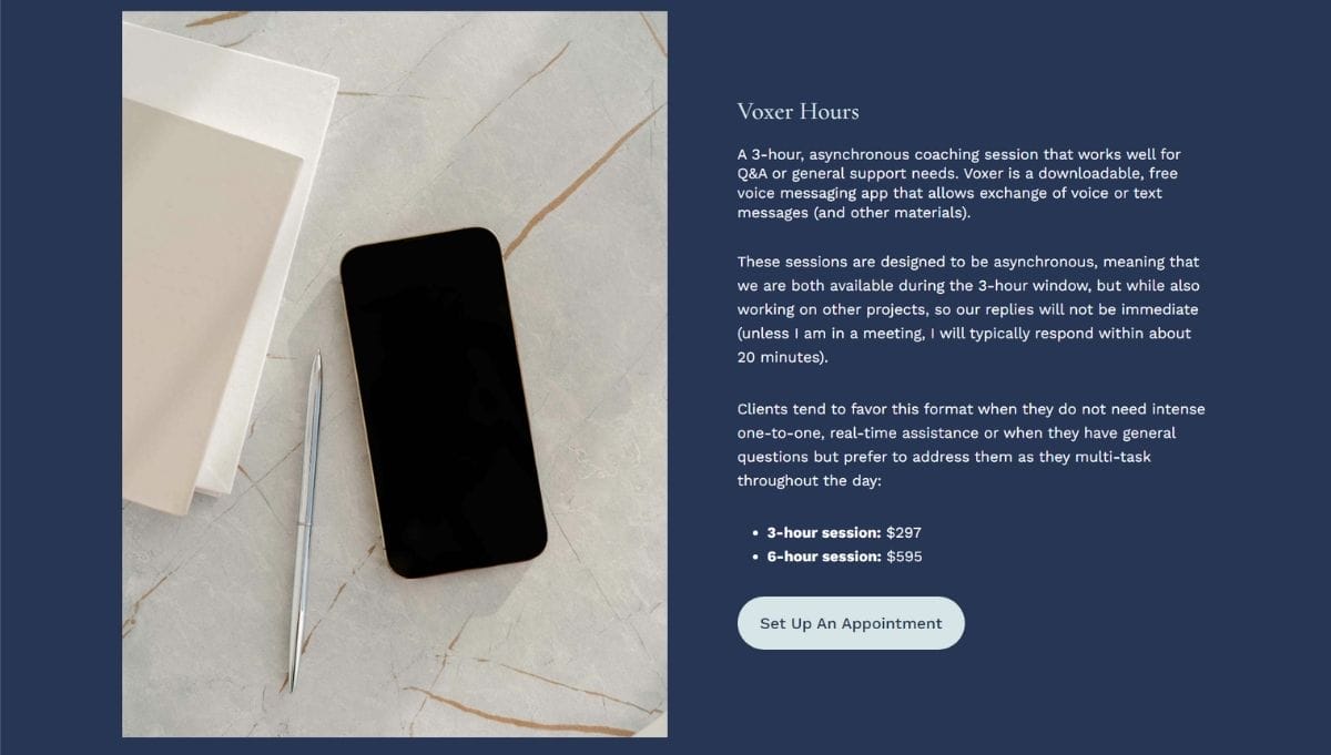
We integrated TidyCal so potential clients and coaching candidates could book directly from the website without a back-and-forth email exchange. Rather than embedding multiple calendars on the Contact page, we used a button that directs people to Nicola’s TidyCal booking page, where clients can book and pay for each of her session types from one connected place.
Legal Pages
Nicola had purchased a legal template kit but hadn’t yet set up the pages. We took care of all three during the Rejuvenation Day: Privacy Policy, Terms of Service, and a Copyright Notice, all formatted and linked in the footer.
Social Profiles and ORCID iD
In Nicola’s professional world, an ORCID iD is a meaningful credential, a persistent digital identifier that links a researcher to their published work. We added it to the navigation header alongside LinkedIn and Instagram, making her professional identity immediately visible to anyone who visits.
Tutorial Videos
After the day wrapped, I recorded a set of custom video tutorials so Nicola could manage the site confidently on her own: how to adjust global colors and typography, how to edit and create blog posts using Kadence Blocks, and how to create reusable patterns. These live in her client portal and stay available for as long as she needs them.
The One-Day Transformation
By mid-afternoon, the site was already taking shape. Nicola checked in during the day:
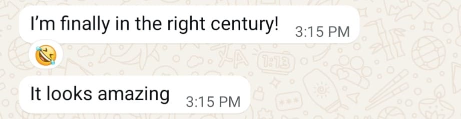
She had a site that actually matched her credentials. Clean, structured, professional, and easy to navigate for both of the audiences she serves. Her reaction as the site was wrapping up:
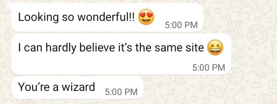
Then she found out it was my first Website Rejuvenation Day:
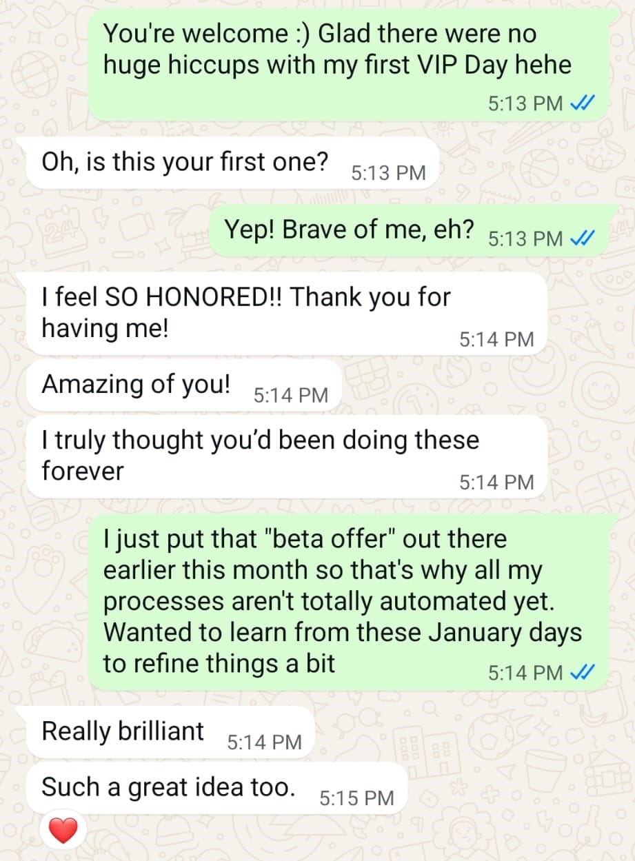
That reaction meant a lot. But it also made sense: this wasn’t my first website. It was my first one-day website makeover. The content didn’t change. The expertise didn’t change. The way the site communicated that expertise finally did.
The After
A few months later, I checked in to see how things were going. Nicola didn’t have hard numbers, but she’d noticed a difference.
“I have definitely noticed an increase in enquiries since you resurrected my site! It really seems like people are now better able to easily locate the contact form than in the era of my old website! And whenever I do pop into the admin end of the website, it all feels much more intuitive and user-friendly since your updates.”
More enquiries. An easier-to-find contact form. A backend that actually makes sense to manage. For a site that hadn’t changed in a decade, that’s a meaningful shift.
So exciting to see my beautifully rejuvenated website emerge within hours
“I can’t recommend Liz highly enough if you’re looking for an expert to help you rejuvenate or design your website! My old website’s design hadn’t been touched in more than a decade, so believe me when I say it was long overdue for some TLC. So, I jumped at the chance to take advantage of Liz’s Website Rejuvenation Day service.
Liz manages to perfect the blend of professionalism and personalization in how she applies her expertise for her clients. The whole process was so well organized, and it all went so smoothly. This was a huge relief for me, because my tech skills are minimal, and I was dreading having to do a lot of behind-the-scenes admin for the day. But I didn’t need to — we had a call before the Rejuvenation Day and Liz laid out all the steps and gave me a To Do list. This made it super easy for me to know what I needed to provide her with.
Liz kept in touch regularly throughout the day itself, and it was so exciting to see my beautifully rejuvenated website emerge within hours. I absolutely love it. And she has put together a bunch of How To videos for me, to guide me with some of the key things I’ll need to do on the admin side.
Liz is quite simply a website wizard — I feel like she transformed my website from analog to digital! It’s great to be back in the current century! Liz is really awesome — you should jump at the chance to let her work some magic on your website.”

Your website should feel like you.
If your site hasn’t been meaningfully updated in a while, and you know it no longer reflects where your business actually is, a Website Rejuvenation Day might be exactly what you need.
We spend one focused day working through your highest-priority updates together. You end the day with meaningful improvements and a site you’re proud to share.

