Neatly Balanced
A complete visual overhaul for a professional home organizing company that had outgrown its website.
Project Overview
Neatly Balanced had been Kristy Edwards’ business for years before it looked like one online. The website had accumulated content from an earlier chapter of the company—a WooCommerce shop, a membership area, a Recipes dropdown with more items than most sites have pages—while the actual business had grown into a professional organizing team serving clients across six states.
The branding was disconnected from the logo Kristy loved. There was no way for clients to book or pay. And nothing about the site reflected the team behind it.
In one Website Rejuvenation Day, we rebuilt the visual system from the ground up, simplified the entire site structure, and got a real booking flow in place. By the time Kristy saw the first progress update that morning, she could already see how everything was coming together.

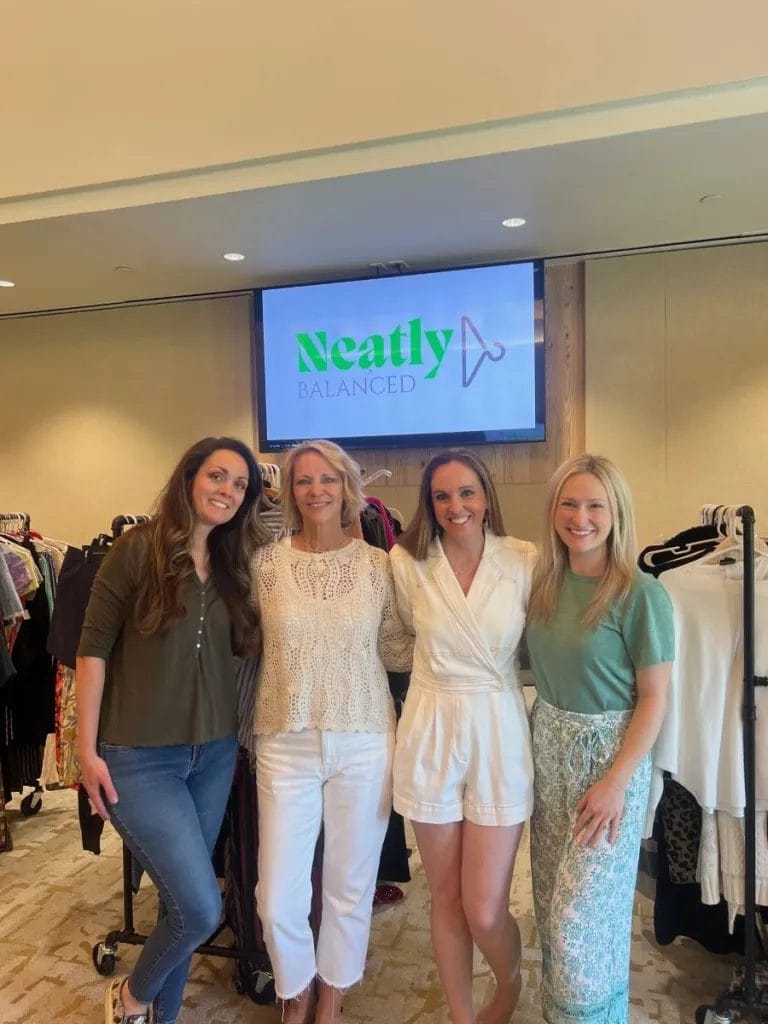
About Kristy
Kristy Edwards founded Neatly Balanced in early 2020, about one week before global pandemic shutdowns, on a mission shaped by more than just a love of organization.
A decade earlier, Kristy took a mission trip to Honduras that changed how she thought about possessions and generosity. She came home committed to living more minimally and doing work that directly helped others.
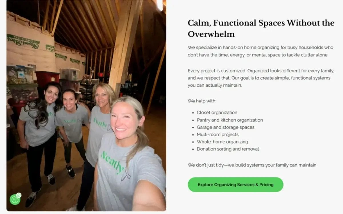
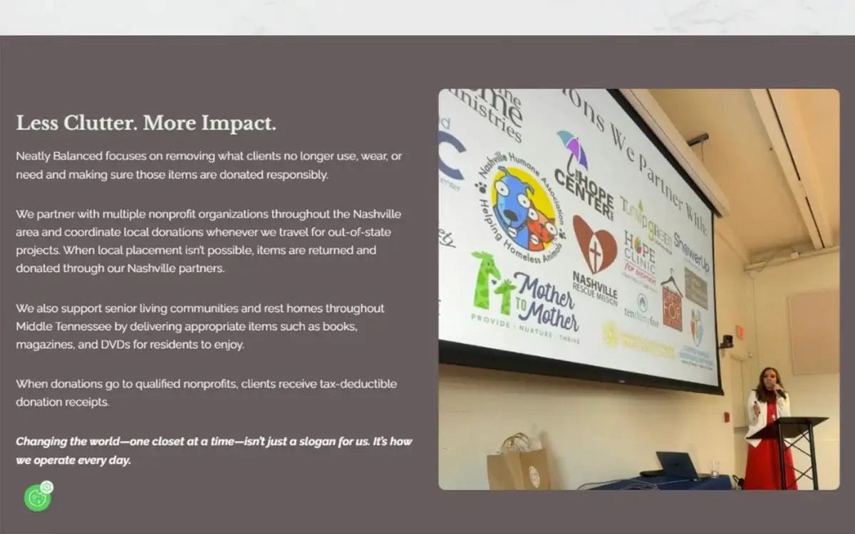
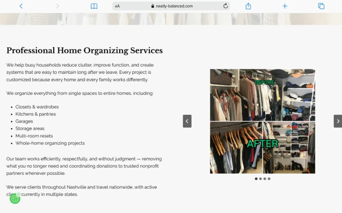
That heart for service is built into every Neatly Balanced project: the team sorts, donates, and coordinates with nonprofit partners so that what clients no longer need can support people who do.
Today, Neatly Balanced has grown into a multi-member team that is ‘changing the world, one closet at a time’ for clients throughout Nashville and across the country.
Project Highlights
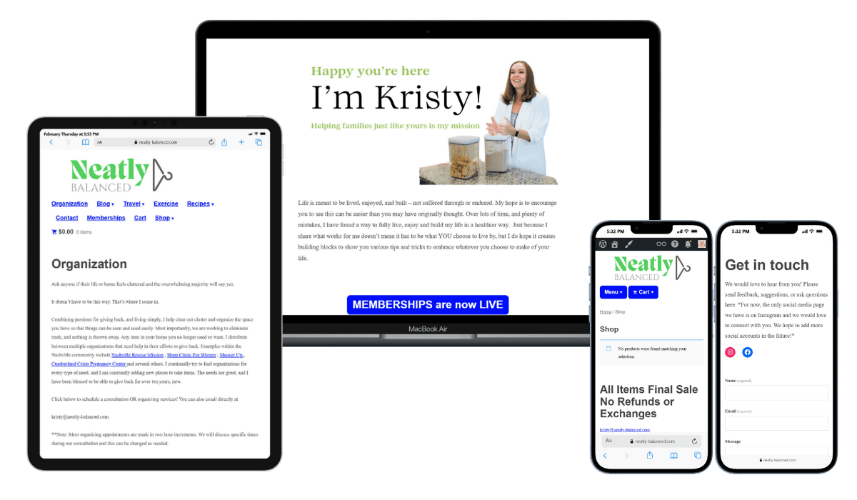
The Before
Kristy reached out after spotting an ad in a local email blast. Her message was direct: “Our website is in need of a complete overhaul.”
When we got on the phone, the picture became clearer. The site had been built years earlier when the business looked very different. Kristy was doing everything back then: organizing, recipes, lifestyle content, and a WooCommerce shop and membership area that never really got off the ground.
But the business had evolved. The website hadn’t.
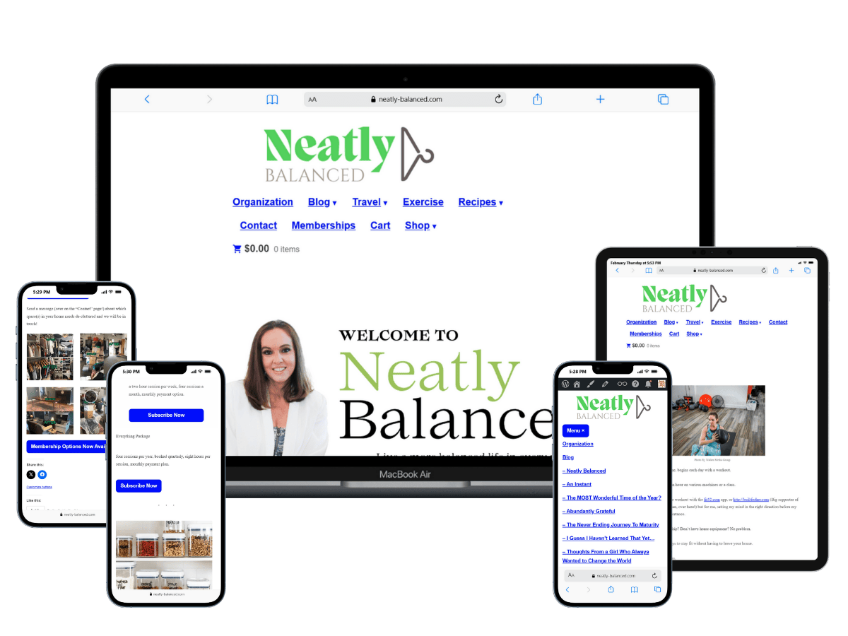
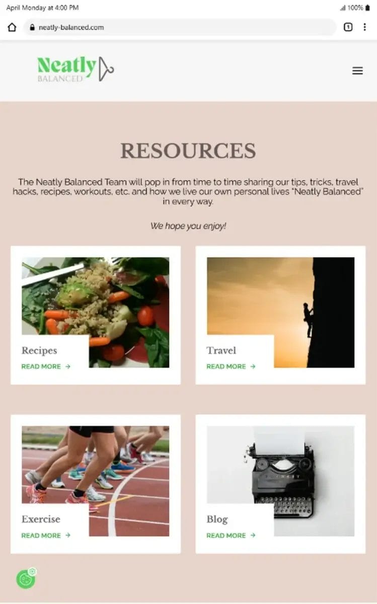
The navigation told the whole story
Nine menu items spread across two rows—Organization, Blog, Travel, Exercise, Recipes, Contact, Memberships, Cart, Shop—with dropdowns that cascaded endlessly on mobile. The Recipes dropdown alone had more items than most websites have pages. A first-time visitor had no real way to find what they were actually looking for.
The homepage said the wrong thing
“Welcome to Neatly Balanced / I’m Kristy!” is a fine introduction for a personal blog. But Neatly Balanced wasn’t a personal blog anymore. It was a professional organizing company with a team, multi-state clients, and packages that run several thousand dollars. None of that came through.
The colors were wrong
The green on the site was, in Kristy’s words, “puke green”—nothing like the bright, clean green in the Neatly Balanced logo. She also admitted she doesn’t like the color blue, but there were pops of “default blue” all across the site, from the buttons to the links. There was no visual continuity between the brand she’d built and the site representing it.
The shop and memberships pages were quietly undermining trust
Both pages were visible in the navigation. Neither had ever been active. The Shop page greeted visitors with “No products were found matching your selection.” The Memberships page had three bright blue Subscribe Now buttons but no real explanation of the features and benefits of these memberships. For a business asking clients to invest thousands of dollars, those pages were doing real damage.
There was no way to book or pay
Kristy described exactly what she wanted: a “happy button” for her clients, something as easy as Amazon. It didn’t exist.
The site didn’t reflect the team
Neatly Balanced was no longer just Kristy. She had a small team, clients in six states, and a growing reputation. None of that showed up anywhere on the site.
Our Solution

Colors and Typography
We started with what Kristy already had: her logo. The Neatly Balanced mark—a bright green & gray wordmark with a gray hanger sitting on its side—became the anchor for the entire palette.
From there, I built out a full color system: soft mint and blush for backgrounds, an off-white and near-black as neutrals, and the logo’s original green and gray as the primary accent colors. The stark white and blue were out. Kristy was clear on that. What replaced it was a palette that felt warm, cohesive, and intentional in a way the old site never did.
For typography, we paired Libre Baskerville—a high-contrast serif that complemented the style of Kristy’s logo wordmark—with Raleway for body text. Raleway happened to be the same font used on a site that had originally inspired Kristy’s vision, so the connection felt right.
I also created a basic brand guide with a fun favicon as a bonus so the visual system would be easy to maintain going forward. Kristy came in with a logo. She left with a visual identity.
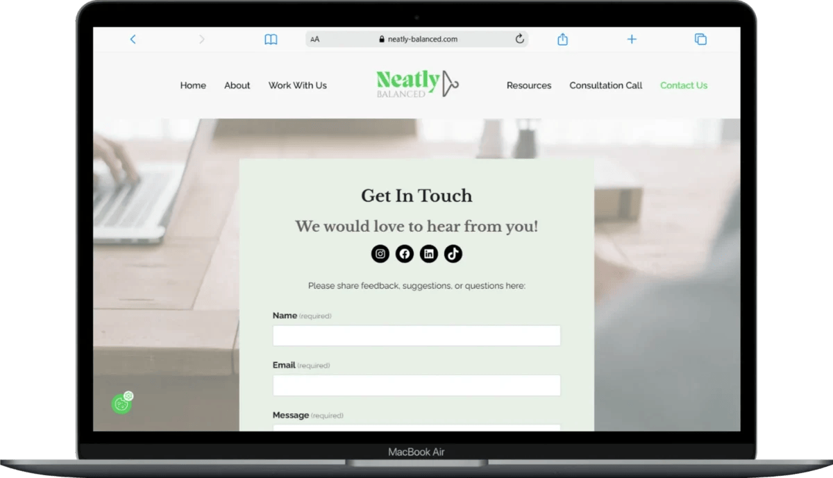
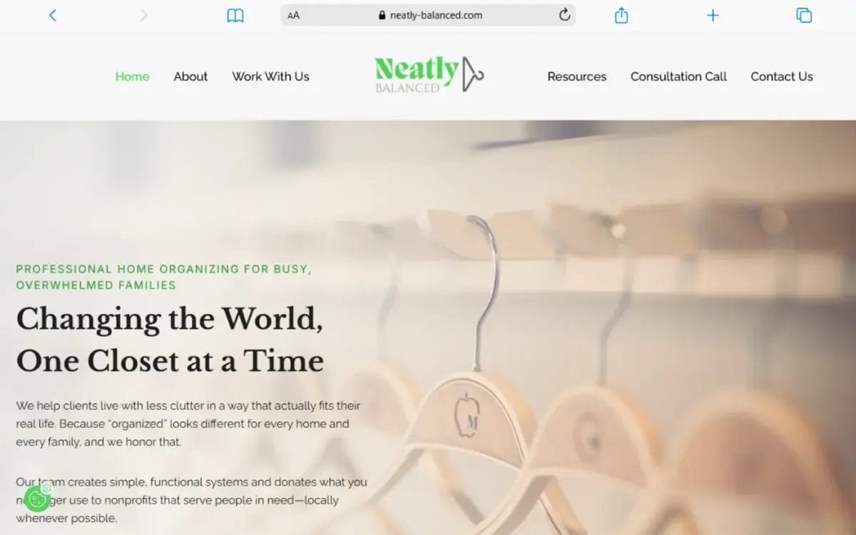
Navigation and Structure
The nine-item, two-row menu is gone. In its place: Home, About, Work With Us, Resources, Consultation Call, and Contact Us—centered around the logo, immediately legible on any device.
Adding “Work With Us” as a page name was a small but meaningful shift. It acknowledges that there’s a team, and it speaks to potential clients the way a professional organizing company actually should.
When Kristy was more blogger than business founder, she had Travel, Exercise, and Recipes in the navigation as well as each blog post title as a dropdown item. Now there’s a single Resources page in the menu so the content is accessible but not the main focus of the site.
TidyCal Booking Calendar
One of Kristy’s clearest goals was giving clients a way to book and pay online without the back-and-forth of email scheduling. We integrated TidyCal, a $29 lifetime purchase, directly into the site, building out three separate calendar types.
Free consultations have their own page, leading with a calendar that syncs directly with Kristy’s schedule. Donation porch pickup appointments are split into first-visit and return pricing, each with integrated payment and an intake form so the team has everything they need before they arrive.
I also recorded a tutorial video so Kristy and her team could manage the calendars confidently on their own going forward.
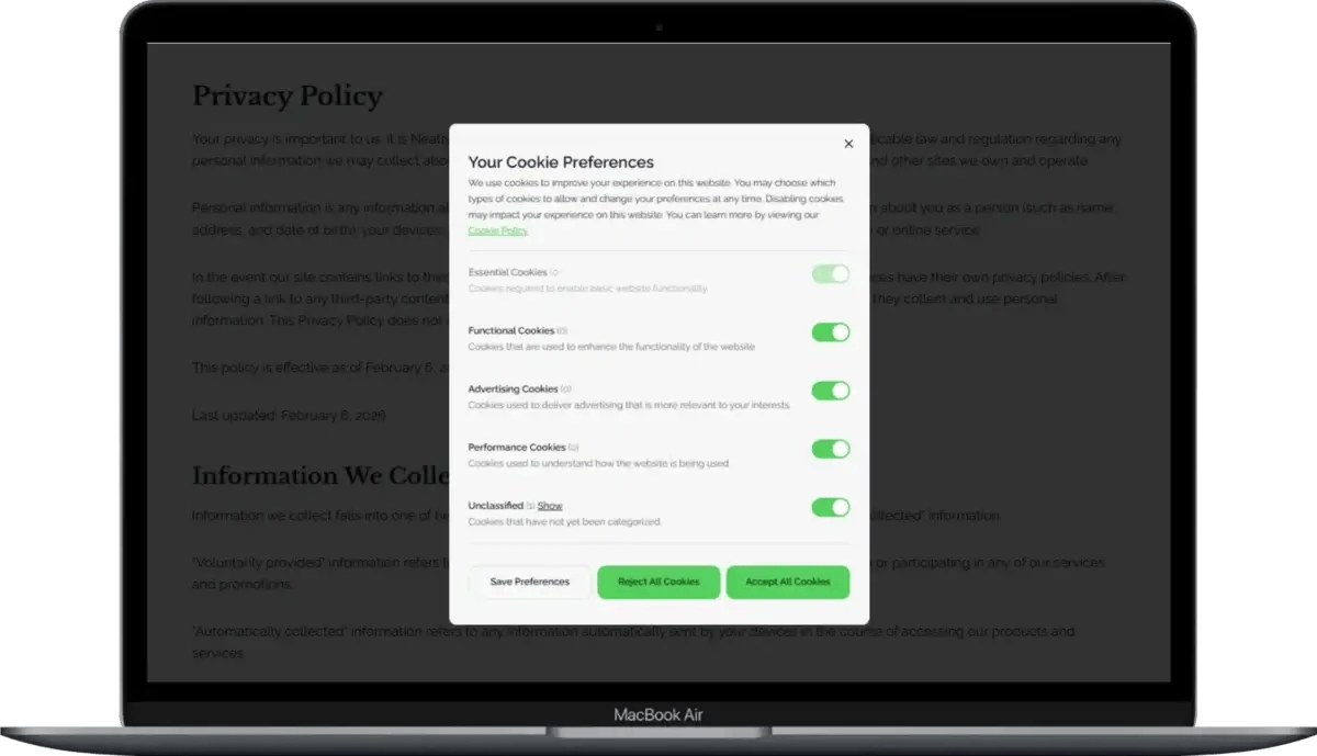
Legal Pages
Using Kristy’s responses from GetTerms’ business questionnaires, I generated and embedded a Privacy Policy, Cookie Policy, and Terms of Service—all of which had been missing from the site entirely.
These were placed in the footer and built to update automatically as her business or site evolves.
A branded cookie consent banner was also installed so the site properly notifies visitors about third-party data collection.
The End Result
By the time Kristy saw the first check-in video that morning, her reaction said everything:
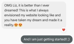

In the afternoon, she finished up a client appointment and had a chance to peek at the progress from her phone:
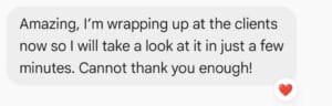
And at the end of the day:
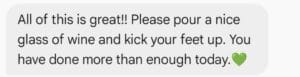
A glass of wine well deserved!
Here’s what changed in one focused day:

The After


“Liz was so helpful, always responded quickly and efficiently, explaining everything in a way I could understand. She always looked for ways to be cost-effective, saving me money, as well as lots of time. I would highly recommend anyone to reach out to her!”


Ready to work together?
If your website has been sitting there, not quite looking the way you want it to, not quite doing the job you need it to do, a Website Rejuvenation Day is worth a closer look.
One focused day. Real, visible changes. A site you’re actually proud to send people to.

