
Homepage Design Tips: What Your Homepage Actually Needs to Do

TL;DR Summary
Homepage Design Tips
- A homepage’s job is to guide visitors toward one clear next step, not tell the whole story of your business
- The most common homepage mistake: too much content competing for attention at once
- Every section of your homepage should support the main action you want visitors to take
- Strong homepages confirm: who this is for, what you help them do, and what to do next
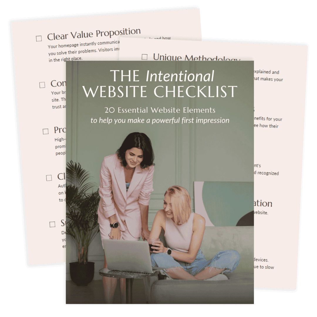
- Use the free Intentional Website Checklist to audit your own homepage right now
What Your Homepage Is Actually For
If you’ve been treating your homepage like a welcome page (a place to introduce yourself, share your story, and explain everything you offer), you’re not alone. Most of the homepages I work on during a Website Rejuvenation Day start this way.
The problem is that visitors don’t land on your homepage to learn your whole story. They land there with a question: am I in the right place?
Your homepage’s job is to answer that question quickly and then guide them somewhere. That’s it. Not to explain every service you offer, showcase every accomplishment, or tell your full origin story. Those things have their place. But the homepage is not that place.
Think of it less like a welcome mat and more like a decision-support tool. When it’s working, a visitor lands on your homepage and within a few seconds knows that yes, this is for me, and here’s what I should do next.
The homepage design tips that actually make a difference are the ones that serve that goal: clarity, direction, and a clear next step.
The Most Common Homepage Problem I See
I work on a lot of homepages. And the pattern I see most often is one of two things:
1. The homepage tells a story instead of guiding a decision. It’s beautifully written, maybe even genuinely moving. But a visitor who doesn’t already know you isn’t sure what to do with it. They read it and then… leave.
2. The homepage has a little bit of everything on it. Every service gets equal billing. There’s a blog preview, a podcast player, a shop section, a testimonials wall, and a lead magnet, all on the same page. The intention is usually to give visitors options. What it actually does is make it impossible for anyone to know what to focus on. When everything is featured, nothing is.
In both cases, visitors leave not because your work isn’t good but because the page didn’t give them a reason to stay.
When I work with clients on homepage updates, the first question we answer together is: What is the one main thing we want visitors to do when they land here? Everything else on the page gets evaluated through that lens. Does this section support that goal? If not, it either gets moved somewhere else or it gets removed entirely.
That single shift, from “show everything” to “guide one action”, is where most homepage improvements start. If you’re not sure whether your homepage is actually doing its job, this blog post is a good place to start.
Homepage Design Tips: The Elements That Actually Matter
Your headline should make a visitor feel immediately seen. Not “Welcome to my website” or your business name as the headline, but a sentence that answers: who is this for, and what does this help them do?
A headline that answers the right question
Your headline should make a visitor feel immediately seen. Not “Welcome to my website” or your business name as the headline, but a sentence that answers: Who is this for, and what does this help them do?
A strong headline doesn’t try to be clever. It’s clear. A visitor should be able to read it and think, “yes, that’s me.” If they have to work to figure out what you do, you’ve already lost them.
A clear, specific value statement
Right after the headline, visitors need to understand your unique angle. Not just what you do, but how you do it differently or who you specifically serve. This is sometimes called an elevator pitch: the one-sentence version of why someone should work with you instead of the next person who shows up in their search results.
This is where your distinct perspective has a home. Not three paragraphs of it. Two to three sentences that earn the next scroll.
A single, prominent call to action
What’s the one thing you want a visitor to do? Book a call? Grab your freebie? Browse your services? Choose that, and make it obvious. Put it above the fold (visible before scrolling) and repeat it at natural stopping points throughout the page.
If you have multiple CTAs competing at the top of your page, visitors default to doing nothing. One clear action removes that friction.
Evidence that you can help
Visitors need a reason to trust you before they take action. Testimonials from past clients, relevant credentials, or even a short, specific description of the transformation you create all serve this purpose.
Strategic placement matters here. Don’t save all your social proof for the bottom of the page. Put it near the CTA, where the decision is actually being made. For more on how to use testimonials effectively, the post on
Strategic placement matters here. Don’t save all your social proof for the bottom of the page. Put it near the CTA, where the decision is actually being made. For more on how to use testimonials effectively, take a look at my blog post on how testimonials add credibility to your website.
“I hired Liz for a much needed homepage redo and to my delight she turned a sad face into a super happy legit biz! Liz’s expert design skills, client management and versatile web development chops are top notch.
Liz is so easy to work with, making the whole process absolutely painless. We started with the homepage and I ended up with several new tweaks across the site that have made a massive impact to the visual cohesiveness. Thank you Liz!”
An email opt-in with a relevant lead magnet
Your email list is the one marketing channel you actually own. Social platforms change their algorithms; your list doesn’t. Your homepage should give visitors a clear reason to join it.
The key word is relevant. Your lead magnet should solve a specific, real problem your ideal clients have, not just be a generic “five tips” PDF. When the freebie is directly connected to your services, the people who sign up are pre-qualified.
Simple form. Clear headline on the opt-in. One ask.
Navigation that makes sense
Your menu should reflect the most important paths on your site, not every page you’ve ever published. A visitor who can’t figure out where to go next will leave. Menu labels should say what they mean, not what sounds sophisticated. If “Solutions” could just be “Services,” use “Services.”
Your homepage itself doesn’t need to contain every page of your site. It needs to point visitors in the right direction.
What Your Website Needs Right Now
What to Remove from Your Homepage
Homepage design tips usually focus on what to add. But what you take off the page is often more important.
Some of the most common things that clutter homepages and dilute their impact:
- Long, narrative-style origin stories that belong on the About page
- Every service or offer you provide, listed with equal prominence
- Multiple competing CTAs in the same section (“Book a call, buy the course, grab the freebie, follow on Instagram”)
- Blog post previews, podcast players, or shop sections that pull attention away from the main action before a visitor has even decided they want to stay
- Generic stock photos that don’t reflect you or your brand
None of these things are bad on their own. They just have better homes than your homepage.
The question to ask about every element: does this help a new visitor decide to take the next step? If the honest answer is no, it probably belongs somewhere else.
A Note on Mobile and Speed
Even the most strategically designed homepage will lose visitors if it loads slowly or falls apart on a phone. With more than half of web traffic coming from mobile devices, this isn’t optional.
A few practical things worth checking:
- View your homepage on your actual phone, not just in your browser’s mobile preview. They are not the same.
- Make sure your CTA buttons are large enough to tap easily on a small screen.
- Compress images before uploading. Oversized images are one of the most common causes of slow load times.
- If your site is on WordPress, be selective with plugins. Every plugin adds load time potential, and many do nothing your theme can’t already handle.
Speed and mobile experience are part of what I look at in every Website Wellness Review—not as a technical checklist, but because they directly affect whether a real visitor stays long enough to take action.
Frequently Asked Questions
What should a homepage include for a service business?
A service business homepage needs: a headline that speaks directly to your ideal client, a short value statement explaining what you do and who you help, a clear primary call to action, some form of social proof (testimonials or credentials), and an email opt-in. Everything else should earn its place by supporting one of those core elements.
How long should a homepage be?
Long enough to answer the visitor’s core question and guide them to the next step, no longer. For most service businesses, that means a clear above-the-fold section, a brief value statement, a services or offer overview, social proof, and an email opt-in. There is no universal word count. The better question is: does every section on this page serve the goal?
Where should testimonials go on a homepage?
Near the action you want visitors to take. If you have a primary CTA early on the page, put a testimonial close to it rather than just at the bottom. Trust-building should happen right before a decision point, not after visitors have already scrolled past it.
How do I know if my homepage is actually working?
Look at your analytics and ask: are visitors clicking your primary CTA? Are they bouncing immediately? Are they navigating to the pages that matter most (Services, Contact)? If visitors are landing and leaving without taking any action, that’s a sign that the page isn’t giving them a clear enough next step. The free Intentional Website Checklist is a practical starting point for evaluating this yourself.
Can I update my homepage without redesigning my whole site?
Yes, and often a focused homepage update delivers more impact than a full redesign would. A lot of the work is strategic: clarifying the headline, simplifying the navigation, adding or repositioning social proof, and making the CTA more prominent. If you’re not sure what your homepage specifically needs, a Website Wellness Review is a good place to start. It gives you a prioritized list of what to address, so you’re making intentional updates instead of guessing.
Ready to See Your Homepage Through Fresh Eyes?
If you’ve been wondering whether your homepage is actually doing its job (guiding visitors, building trust, and moving people toward working with you), the Intentional Website Checklist is the fastest way to find out.
It’s a free 20-point checklist that walks you through the key elements of your homepage (and the rest of your site) so you can spot what’s working and what’s quietly holding you back.

And if you’d rather have a second pair of eyes on your homepage specifically, from someone who looks at sites strategically, not just visually, that’s exactly what a Website Wellness Review is for. I’ll walk through your site from two perspectives: as an experienced web designer and as a first-time visitor. You’ll come away with a clear report and a prioritized list of what to actually focus on.