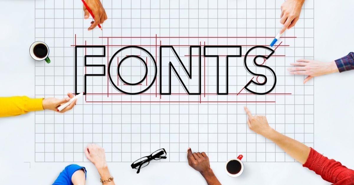
Google Font Pairings for Websites: Choose Fonts That Build Trust
Most website owners think about fonts the same way they think about wall paint: pick something you like, make sure it doesn’t clash, and move on. But typography on a website is doing something more specific than that.
Before a visitor reads your headline, before they understand what you do or who you help, they’ve already formed an impression based on how your site looks. That impression is partly about layout and color, but fonts are a significant part of it. A mismatched or hard-to-read typeface signals carelessness the same way a typo does. A font that’s too decorative for the context reads as trying too hard. A body font that’s too small or too condensed sends people away before they’ve absorbed anything.
This post covers what makes a strong font pairing, how to choose Google fonts that support your brand credibility, and specific combinations that work well for service-based businesses. If you want the curated shortcut, the Google Font Pairing Guide includes 20 professionally matched pairs with exact sizing recommendations.

This post may contain affiliate links, which means I may receive a commission, at no extra cost to you, if you make a purchase through a link. Please see my full affiliate disclosure for further information.

TL;DR Summary
Font Pairings
- Typography is a trust signal, and your fonts communicate professionalism (or the lack of it) before anyone reads a word
- Use 2-3 fonts maximum: one for headings, one for body text, and an optional script accent for specific elements
- Google Fonts are free, fast-loading, and reliable across all website platforms
- The most effective pairings create contrast in style (serif heading + sans serif body, or vice versa) while staying cohesive in tone
- For ready-to-use pairings with sizing and usage guidance, the Google Font Pairing Guide covers 20 curated combinations
Understanding Font Types for Web Design
You don’t need to know the full history of typography to choose well for your website. But understanding the two main categories helps you make intentional decisions.
Serif Fonts
Serif fonts have small decorative strokes, called serifs, at the ends of the letterforms. They tend to read as traditional, established, and authoritative. In print they’re the standard for body text, but on websites they work especially well as headline fonts, where their structure creates visual weight and presence without compromising readability at larger sizes.
Well-known Google serif fonts: Playfair Display, Merriweather, Noto Serif, Lora, Libre Baskerville, and Marcellus.
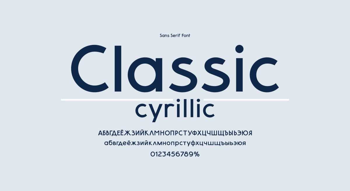
Sans Serif Fonts
Sans serif fonts have no decorative strokes—clean, even letterforms without the extra details. They tend to read as modern, approachable, and clear. For body text on screens, sans serifs are generally the stronger choice because their simplicity holds up at small sizes and across varying screen resolutions.
Well-known Google sans serif fonts: Montserrat, Open Sans, Lato, Raleway, Source Sans Pro, and Inter.
Script and Accent Fonts
Script fonts mimic handwriting or calligraphy and are best used sparingly—for a single line of text, a logo element, or a specific decorative moment. They add personality but break down quickly when used for body text or long passages. Treat them as seasoning, not a main ingredient.
How I Think About Font Pairings (And What I Use on My Own Site)
As a web designer who loves exploring typography—yep, I subscribe to YouTube channels all about typography—I’ve learned that the perfect font pairing can transform a good website into a great one.
When it comes to choosing fonts for website headings and body text, I usually recommend sticking with Google Fonts. They’re free, they work well across different platforms, and you don’t have to worry about complicated licensing.
When I first branded E. Houston Studio, I used Alegreya for headings paired with Alegreya Sans for body text. From the same font family, they worked together naturally. But over time Alegreya started to feel too decorative for my brand, particularly at larger sizes and in all-caps contexts.
I switched to Marcellus for headings and Lato for body text, and that’s still what I use. Marcellus has elegant serifs that feel both polished and approachable, without the heaviness that can come with more traditional serif fonts. Lato is highly versatile, reads well at any size, and has enough personality to avoid feeling generic. Together they reflect the balance I aim for in my work: professional but never stiff.
That process (noticing what wasn’t working, understanding why, finding something that fit the actual goal better) is what good font selection looks like in practice. It’s not about finding the prettiest fonts. It’s about finding the ones that do the right job for your brand.

How to Choose Font Pairings for Your Website
Start with the job, not the look
Before you open Google Fonts, answer two questions: What do I want my site to feel like to a first-time visitor? And what’s the primary job of my typography—establishing authority, building warmth, communicating precision, signaling creativity?
Your heading font carries the brand personality. Your body font carries the content. They need to work together, but they have different roles. Choose each with its specific job in mind.
Create contrast, not competition
The most reliable pairing strategy is contrast: a serif heading font with a sans serif body, or vice versa. When both fonts are from the same category and similar in weight and proportion, they can blur together and flatten the visual hierarchy. Contrast gives the eye something to respond to and helps readers move through the page naturally.
A practical starting point is to pair fonts from the same type superfamily. Pairing a font with its own companion variant—like I originally did with Alegreya and Alegreya Sans—guarantees visual harmony even if you’re not yet confident in evaluating type relationships independently.
Check the technical requirements before you commit
Sizing and spacing: Good typography requires more than choosing the right fonts — the size relationships between H1, H2, H3, and body text matter, as do line height and letter spacing. This is where a curated guide (rather than just a list of font names) makes a real difference.
Web compatibility: Google Fonts are free, well-maintained, and work across all major website platforms including WordPress, Showit, Squarespace, and Systeme. They’re the most practical foundation for most service provider websites.
Loading speed: Each additional font weight (bold, light, italic, etc.) adds to your page load time. Load only the weights you’ll actually use. Two or three weights per font is usually sufficient.
Mobile readability: Test your choices on a phone, not just a laptop. Body text that reads beautifully at 16px on a large monitor may feel cramped on a small screen. Aim for a minimum of 16px body text, and check that your heading font doesn’t lose legibility when scaled down.

What Your Website Needs Right Now
Google Font Pairings to Know
These are tried-and-tested combinations that work well for service-based businesses. Each creates a clear visual hierarchy and holds up across different screen sizes.
For Professional Service Providers
- Playfair Display + Source Sans Pro: A classic combination. Playfair’s high-contrast serifs create elegant headlines; Source Sans Pro keeps body text clean and highly readable. Works well for consultants, coaches, and therapists aiming for a polished, trustworthy feel.
- Marcellus + Lato: This is the pairing I use on my own site. Marcellus has refined serifs without feeling heavy or traditional; Lato is versatile and reads well at any size. A strong choice for service providers who want professional credibility with a modern edge.
- Oswald + Open Sans: Bold, confident, and clear. Oswald’s condensed structure works well for punchy headlines; Open Sans is one of the most readable body fonts available. Good for businesses that want to project strength and directness.
For Creative and Brand-Forward Businesses
Libre Baskerville + Raleway: Sophisticated without being stiff. Libre Baskerville’s traditional serif structure pairs well with Raleway’s elegant, geometric letterforms. Good for designers, brand strategists, and creative professionals.
Lora + Quattrocento Sans: A refined pairing with strong readability. Lora’s calligraphic quality brings warmth to headlines; Quattrocento Sans keeps body text clean and well-spaced. Works well for businesses where trust and depth are central to the brand.
Cormorant Garamond + Jost: Cormorant’s high-contrast serifs have a distinctly literary quality that works beautifully for editorial-style headers. Jost provides a clean, modern counterpart for body text. A strong choice for coaches and educators who want their site to feel both intelligent and approachable.
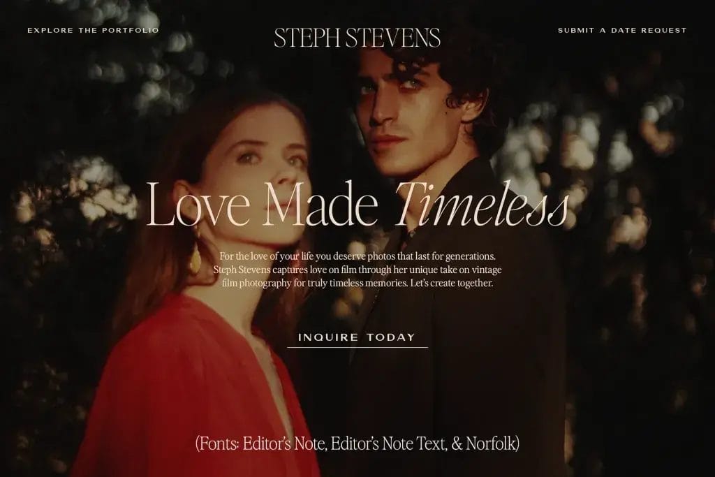
For Script Accent Fonts
Google Fonts handle the foundation beautifully: headings and body text that load fast, look consistent across platforms, and do their job without drawing attention to themselves. But if you want a signature touch that makes your branding feel more distinctive and recognizably yours, that’s where a paid script or accent font earns its place.
Google’s script options are limited and often overused. For distinctive script accents, Jen Wagner Type offers beautifully crafted scripts with alternate characters that make text look genuinely handwritten rather than templated.
Creative Market is also a great source for font duos—pre-matched pairs that take the guesswork out of combining a script with a complementary sans serif or serif.
Use script fonts for a single design element: a pull quote, a subheading accent, your name in a signature-style sign-off. One intentional use reads as designed. Multiple uses reads as decorative overload.
Common Font Pairing Mistakes to Avoid
- Using too many fonts. Two is usually enough. Three is the maximum. More than that fragments the visual identity and signals indecision rather than intentional design.
- Choosing fonts that are too similar. Two sans serifs of similar weight and proportion look like a mistake rather than a pairing. The whole point of using two fonts is to create hierarchy. If they’re too close, you lose the contrast that makes the hierarchy readable.
- Using a script font for body text. Script fonts are decorative by nature. Reading more than a sentence or two of script text is tiring. Reserve them for single-line accents and keep body text in a highly readable sans or serif.
- Skipping the sizing work. Choosing fonts is only half of typography. If your heading sizes don’t scale logically from H1 to H3, or your body text line height is too tight, the pairing will look off regardless of how well-chosen the fonts are. Size and spacing matter as much as the font choice itself.
- Ignoring mobile. Always check your typography on a real phone, not just a browser window resized smaller. What feels readable on desktop can become cramped or oversized on mobile, and mobile is where a significant portion of your visitors are reading.
Tools and Resources for Font Exploration
A few places worth exploring when you’re evaluating options:
- Google Fonts (fonts.google.com): The starting point for web-safe, free typography. Preview fonts at different sizes, see weight variations, and generate the embed code for your platform.
- Fontpair.co: Shows real examples of Google Fonts working together, organized by pairing style. Useful for getting a quick visual sense of how combinations look in practice.
- Fontjoy (fontjoy.com): Generates unexpected but often interesting font combinations using machine learning. Good for breaking out of default choices and seeing options you wouldn’t have thought to try.
- Better Web Type (betterwebtype.com): A free 7-day email course on web typography fundamentals by designer Matej Latin. If you want to understand why certain choices work rather than just what to choose, this is a well-structured introduction.
And for a curated, ready-to-use resource specifically built for service provider websites:
The Google Font Pairing Guide takes the guesswork out of typography. Each pairing includes exact H1-H3 and body sizing recommendations, brand personality notes, and guidance on how to apply it across your website.

“I LOOOOOVE this font pairing guide! I spend way too much time agonizing over fonts, and then end up making decisions based on a whim, having no idea if they work together. I think I’ll use your guide to pick fonts for the slides for the March course. :)”


Frequently Asked Questions
What are the best Google font pairings for a professional website?
Strong combinations for service-based businesses include Playfair Display with Source Sans Pro for a polished, trustworthy feel; Marcellus with Lato for a professional but modern look; and Libre Baskerville with Raleway for a creative yet refined aesthetic.
The right choice depends on your brand personality and the impression you want to make on first-time visitors. Make sure you check out my Google Font Pairing Guide ($9) for 20 professionally curated font pairings—with notes on styling, sizing, and usage for your website. 😊
How many fonts should I use on my website?
Two fonts is the practical standard: one for headings, one for body text. A third accent font (sometimes a script) can be added for specific decorative elements, but use it sparingly. More than three fonts fragments the visual identity and makes the site feel unpolished rather than considered.
What is the best body/paragraph font for a website?
For Google Fonts, Lato (used on my site), Open Sans, Source Sans Pro, and Inter are all strong choices for body text. They’re highly readable at small sizes, well-kerned, and available in enough weights to give you flexibility. The most important factor for body text is readability at the size you’ll actually use it. Aim for a minimum of 16px, with comfortable line height (typically 1.5 to 1.7 times the font size).
Can I mix serif and sans serif fonts on a website?
Yes, and it’s one of the most reliable pairing strategies. A serif heading with a sans serif body (or vice versa) creates natural contrast that helps visitors navigate the visual hierarchy. The key is choosing fonts that are complementary in tone even if different in style. A delicate script serif headline won’t feel cohesive with a heavy geometric sans serif body, but a refined transitional serif like Merriweather pairs naturally with something like Inter or Lato.
How do I know if my font pairing is working?
A working font pairing creates clear visual hierarchy (headings are obviously headings, body text is obviously body text), reads comfortably at all sizes including on mobile, and feels consistent with your brand’s tone. If you find yourself looking at your site and something feels off but you can’t name it, typography inconsistency is often a contributing factor. Test with fresh eyes: come back to your site after a day away and notice your first impression before you start reading.